Lying with Statistics.....Still
Inconvenient data? Disappear it!

Although it’s been a while since I’ve thought data could actually change the actions of the ‘leaders’, I do follow some places. The Chicago updates are one example, and the stats out of King County, Washington are another.
For a long time, this page had the actual breakdown of cases/hospitalizations/deaths between the vaccinated and unvaccinated right on the main page. It looked like this:
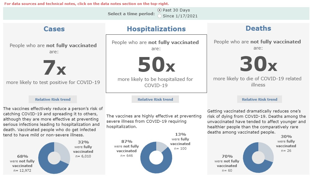
This was from early September when the vaccine stats were still pretty good. Since then, I’ve watched the efficacy numbers come tumbling down, even with the ‘adjustments’ made by the county. The death rate had plummeted from the ‘30x’ you see here down to 16x. I was wondering how they were going to make this inconvenient data disappear. Yesterday I got my answer:
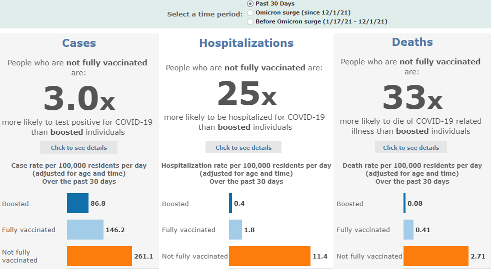
Now we compare unvaccinated people to boosted people! And we don’t JUST adjust for age, we now adjust for TIME! Of course, there may be a few problems:
As more people become fully vaccinated, the size of the unvaccinated population in some demographic and geographic groups begins to approach zero. In some King County zip codes and subgroups of King County residents, due to imprecision in official King County population estimates, we are observing more vaccinated individuals than the total population.
So they’re using estimates that in some cases proclaim there are more vaccinated people than actual people in an area. This wildly overestimates the vaccinated population and make the unvaccinated seem more at risk than they are.
In addition, gone are the charts below this where we could see the ACTUAL stats for the differing vax categories. Now the whole graph has been ‘adjusted.’ Luckily (for now) we can still see the actual data for the last 30 days. Take a look at what we see when we click that details box for deaths:
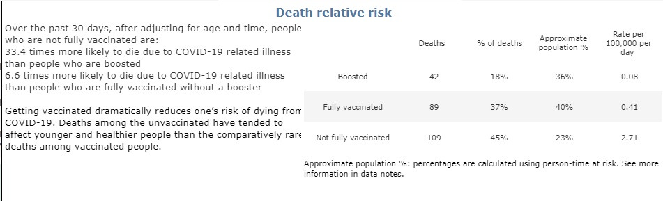
The data (the only actual data on the page!) shows vaccinated people make up 55% of deaths, and that ‘30x’ protection we saw above has dropped to 6.6x. Yet with another round of data ‘adjusting’ and moving the goalposts (again), the county makes it seem as if the vaccines are working.
This is a perfect example of how government can screw up even the easiest tasks. Public health officials should simply provide us with honest data in an easy-to-understand format. But since they went into this with a ‘get people vaxxed’ attitude, they’re constantly fiddling with the numbers trying to make it seem like a good idea still. This governmental tunnel vision hampers our ability to make informed healthcare decisions, while also destroying whatever trust these agencies had remaining. The public health officials have nobody to blame but themselves when we no longer listen to them.

Apologies for the delay here, Substack was acting up earlier. (Not that you even knew it was delayed, I guess.)
The vaccine data never looked good when paying close attention.
50% of COVID vaccine deaths occur in the first 2 days; 80% within the first two weeks. That is the time period that liars in the CDC and media called the vaccine victims "unvaccinated."
That lie made nearly all the difference.