I Got It All Wrong
When you screw up, you have to admit it

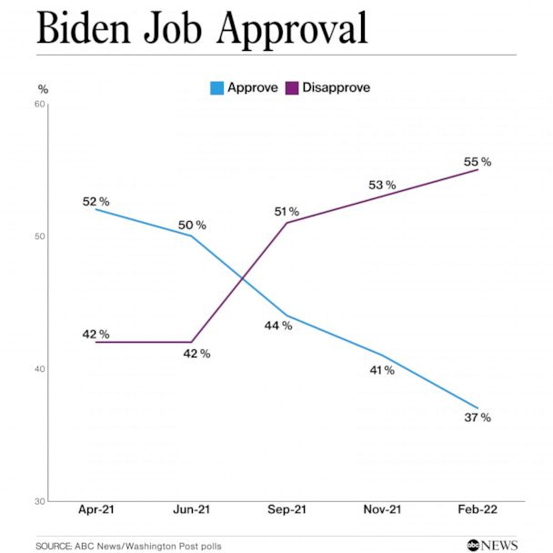
A little over a year ago, I assumed there was no data point that could get the ‘leaders’ to reverse their awful covid policies. I was wrong and I apologize; it turns out this one chart was the key to unravelling the whole thing.
I will strive for improvement in the future.
Has anybody checked the definitions of the classifications because they may be playing bayesian games. I bet the people aren’t counted as disapprovers until 2 weeks after their second survey answer.
I’d like to have a chat with that 37%!